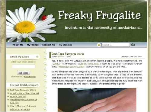
After updating my WordPress to the latest version (2.8 is the best yet!), I had a hankering for a new look. After searching and searching for something kind of funky, fun, and freaky, this is what I ended up with. I’m not 100% sold on it.
What do you think?
Here’s the old theme, so you can compare.
I’d REALLY appreciate your input. I’m having a hard time making up my mind. If the consensus is that this theme just doesn’t cut it, I’ll go back to the old one. Let me know! :D


June 15, 2009 at 2:57 pm
Both are very nice. Sorry, I am indecisive.
June 15, 2009 at 4:40 pm
Hmm, it’s tough to make up my mind. I like the homey look of the new template, and the notebook paper … but the text on these comment forms are way too small, at least for my browser. I can hardly see what I am reading or typing.
I don’t know if that’s something that can be fixed without template change or not, though.
And too bad you can’t have that great saying on your header … or can you?
I guess I’m caught between the two also!
June 15, 2009 at 5:41 pm
The new one wins :-)
June 15, 2009 at 5:53 pm
I also like the new one.
June 15, 2009 at 6:13 pm
Hi There! I like this new look very much!
June 15, 2009 at 6:31 pm
Thanks for your suggestions! Keep ‘em coming!
Historian- the comment font IS waaay too small, I agree. I spent about an hour trying to figure it out to make it larger, but gave up. I’ll still try. I can alter the header to include the blog description. I kinda forgot about that!
Agnes, Jude, and Chilly- thanks for your input! It really helps.
June 15, 2009 at 9:15 pm
I like it, too. I think it looks like you.
But this teeny tiny font reminds me I need to get new glasses.
June 15, 2009 at 9:30 pm
I like the new template, but I also like the big flower in the header of the previous one. Of course, I am partial to flowers! :-D
June 15, 2009 at 9:32 pm
I like the new theme. I agree that it fits your style and personality. I like the “eclectic” sort of mix of things up at the top. I say keep it, but do what makes you happiest.
June 16, 2009 at 1:07 am
i love this new one!
June 16, 2009 at 1:11 am
I like the new theme, however perhaps it’s a bit cluttered. IMHO. I like a site where the content is primary, and like the simplicity of your previous header. The cottage-ey look is pretty, but may detract from your insightful postings which is what we come here for. It’s always good to have a change, though.
June 16, 2009 at 1:17 am
I don’t mean to sound critical!
Just that I for one prefer your previous layout.
June 16, 2009 at 4:06 am
I think I prefer the old one but maybe I just need to get used to this.
June 16, 2009 at 6:33 am
This new theme has more character than the old one. Love it!
June 16, 2009 at 8:09 am
I think I like the old one but I could get used to this one if you keep it
June 16, 2009 at 12:54 pm
Gosh, I really liked your old theme, but I think I like this new one even better. Except for ooonnnne thing. No ladybug! You need a ladybug somewhere up top. :-) I do really like this new theme though!
June 16, 2009 at 6:13 pm
akaGaGa- TOO true! Almost unreadable it is. I enlarged it a little without making the size too overbearing. How is it now?
Lynne, Cindy, and PJ- thanks for your input! Yes, I liked the old daisy, but it just all seemed too simple. And I’m the kind of person who is always moving the furniture around. lol.
Jan- no worries! You are not being critical; as a matter of fact, I value your input. Thanks for that! Your comments mirrored my own thoughts about the old theme. It was simple, but that was it’s beauty. I will try to clean up the header so the new look does not detract…
Karen, blueyes, and Sasha- thanks!!! It is great reading your thoughts.
Carole- LOL, I just KNEW that’s what you’d say. When I was making the header, I thought “Carole is going to say there’s no ladybug; I need one!” I still need one. Have no fear, I’m on the quest to find and include the perfect ladybug. :D
June 16, 2009 at 8:28 pm
Much better. Maybe I can put off that trip to the eye doctor a little longer.
June 16, 2009 at 11:43 pm
I really like the new one better… it has much more individual style and makes me feel like I’m looking into your personal life experiences more. Keep it!